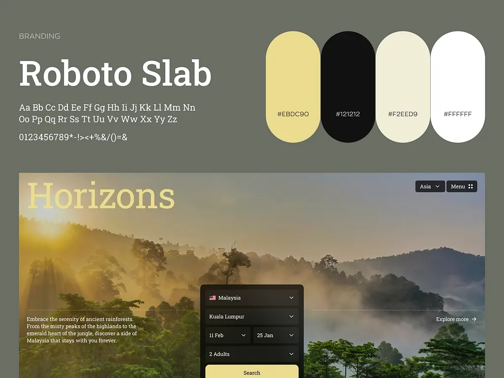
A booking product for slow travel, rebuilt around the reason people actually book — and it lifted bookings 34% on the same traffic.
Client
Horizons
Market
Netherlands
Engagement
Product design
Fee
€22,000
Duration
9 weeks
Shipped
May 2025
01
The problem
Horizons sold three-week overland trips like airline tickets: a grid of dates, a price, a filter for duration. Visitors browsed for eleven minutes and left. 71% of enquiries arrived by email asking questions the product should have answered.
The founders were about to add a fourth filter. The problem was not filtering.
02
The decision
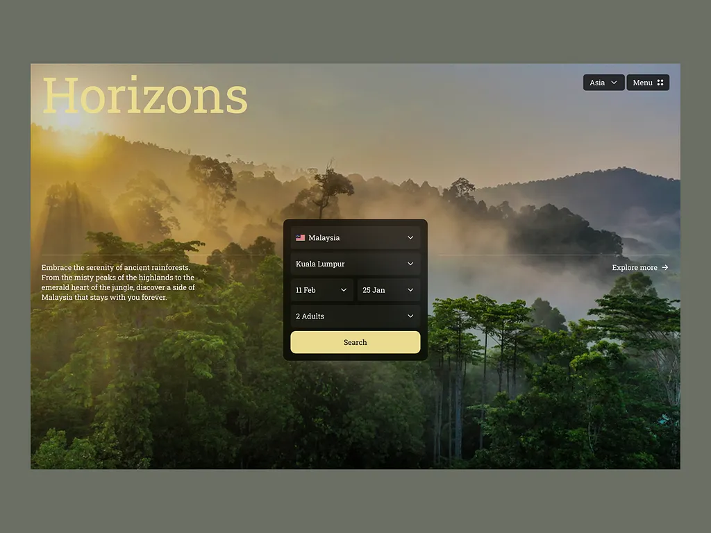
We cut search from the homepage entirely and led with the places instead — one card per region, the feeling first, the dates second. The client disagreed for a week.
We also cut the loyalty scheme, the currency switcher and two thirds of the filter set. Fewer decisions per screen was the whole intervention.
DiscoveryInterface designDesign systemFront-end hand-offWCAG 2.2 AA
03
What changed on screen
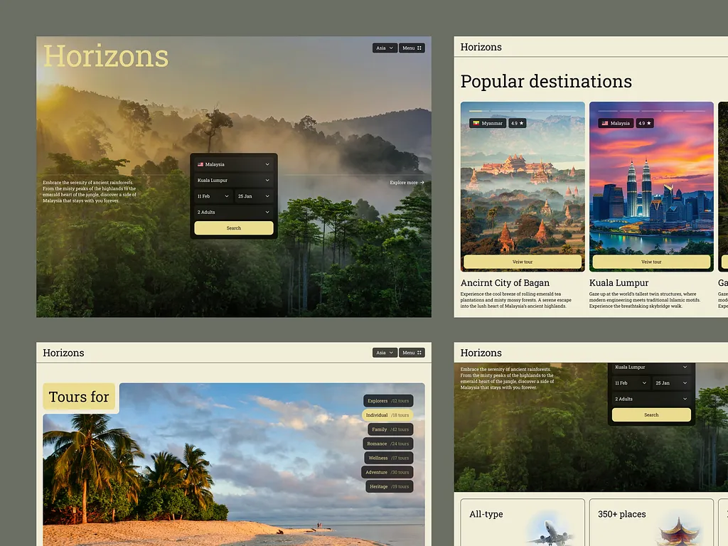
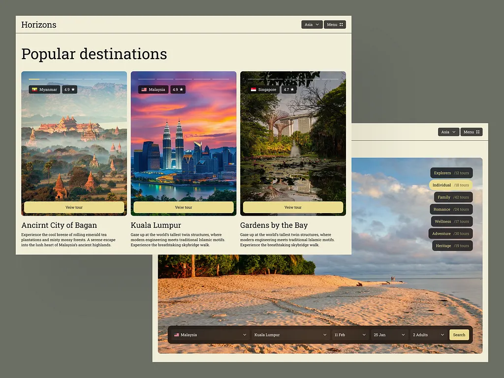
Homepage — search removed, one card per region, the place doing the selling instead of the date grid.
Region detail — a single scroll: what it feels like, what it costs, when it runs. No tabs.
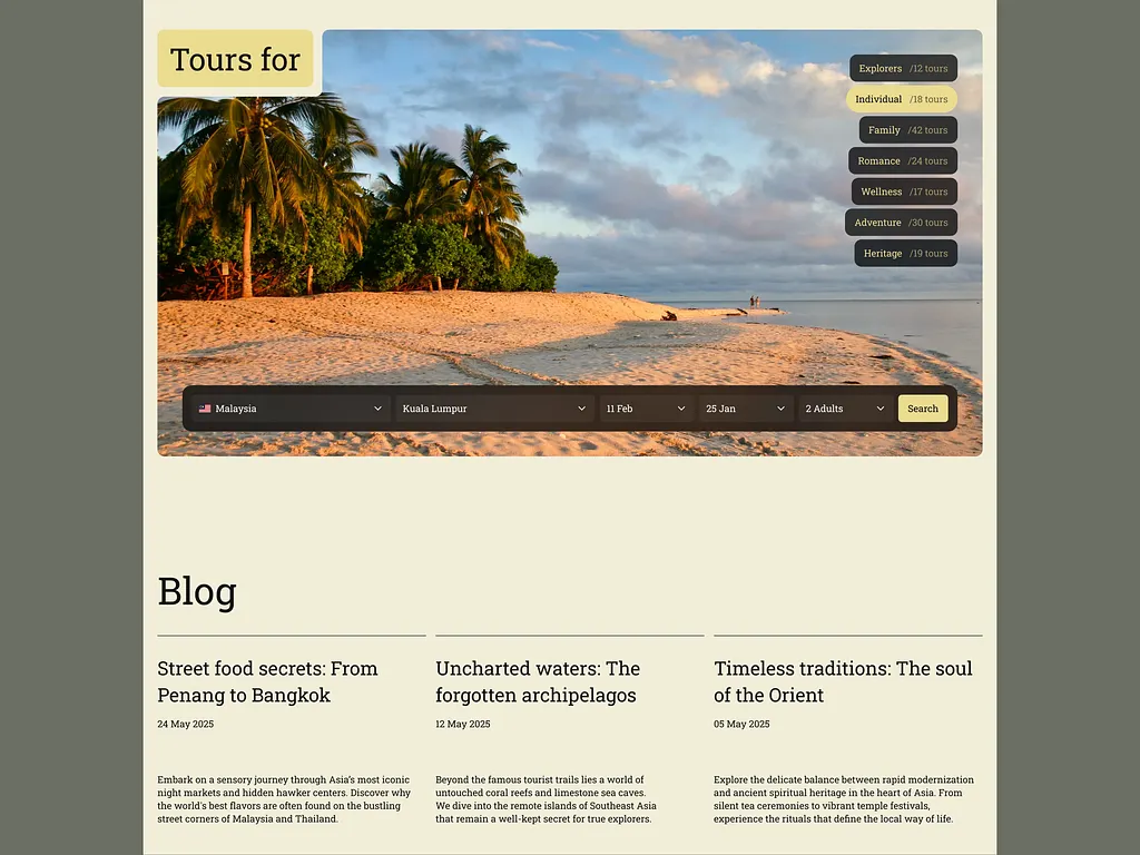
Booking & journal — four steps down to two; tour type and dates now share one screen.
System — 42 components on the tokens the team still ships against a year later.
04
Result
Measured 90 days post-launch vs. the same 90 days a year prior
+34%
Bookings
Same traffic, same price list, same season.
−58%
Pre-sales email
Questions the product now answers itself.
2.4×
Time on region pages
From 11 min browsing to 4 min deciding.
AA
WCAG 2.2
Audited externally at launch.
“They removed the feature we asked for and were right. The product finally explains itself.”